LOGO

Logotype
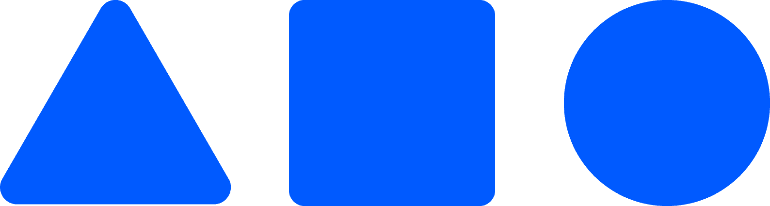
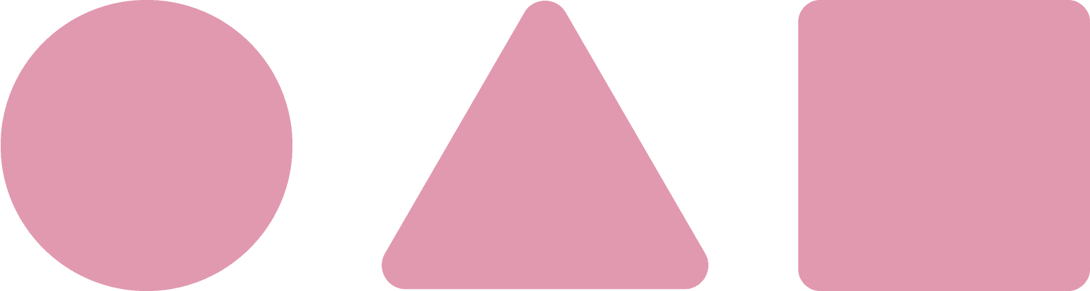
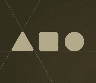
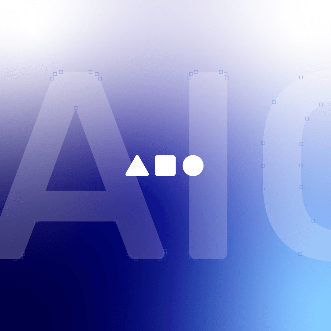
Our typographic signature relies on custom letterforms inspired by the simple geometric shapes that represent the letters of our name (A, I, O). If you look closely, you'll notice that each letter reflects the balance and precision that characterizes our identity, with the triangle (A), square (I), and circle (O) embodying the spirit of innovation and simplicity.
LOGOtype can be used in our primary colors: blue, white, or black, with the option to use shades of these colors to provide visual diversity that enhances our identity.


Clear space
To ensure the clarity and distinctiveness of the Aio logo, no elements such as text or graphics should be placed within the blank space surrounding the logo. This space is essential to maintain a clear visual identity and enhance the logo's impact.


Minimum sizes
The Aio logo is carefully designed to be legible at all sizes, allowing for flexible use in a variety of applications. Whether large or small, the logo maintains its clarity and quality.
General positioning
These guidelines apply to all applications, whether digital or printed, and in both portrait and landscape modes.
When designing any project, the Aio logo can be positioned in one of the four corners or centered on the vertical axis. Take advantage of the available space to enhance the logo's visibility, knowing that it can be used at smaller sizes as long as it remains clear and expressive of the Aio identity.
The logo is designed to be flexible and work perfectly at all sizes, allowing you to use it with confidence in any context.
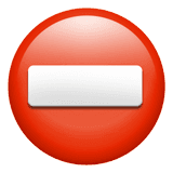
Please don't...
Use colors that are too close to the background color, as it reduces clarity.
Choose colors with the same brightness or low contrast as the background, causing visual discomfort.
Alter the arrangement or design of elements (e.g., reversing positions or adding new shapes).
Make modifications that violate the visual identity guidelines.
Sacrifice sufficient contrast between the logo and the background, making the logo hard to identify.
Please do...
Select colors harmonious with the background, ensuring the logo is noticeably darker or lighter for maximum clarity.
Maintain sufficient contrast between the logo and the background for eye comfort and easy recognition.
Use new colors if they enhance harmony with the background and align with visual comfort (e.g., Material Color system).
Follow the specified order of elements (triangle, rectangle, circle) as per the visual identity guide.
Ensure overall consistency across all applications to maintain a strong and distinct brand identity.


Icon
Since Aio's presence relies heavily on the internet, the consistent appearance of our icon plays a crucial role in ensuring our audience recognizes our brand across different platforms. In many cases, the icon is the first thing people see when they recognize Aio.
The icon can be used in various sizes, from very small (such as 16px for a favicon) to large sizes, while maintaining its clarity and quality.


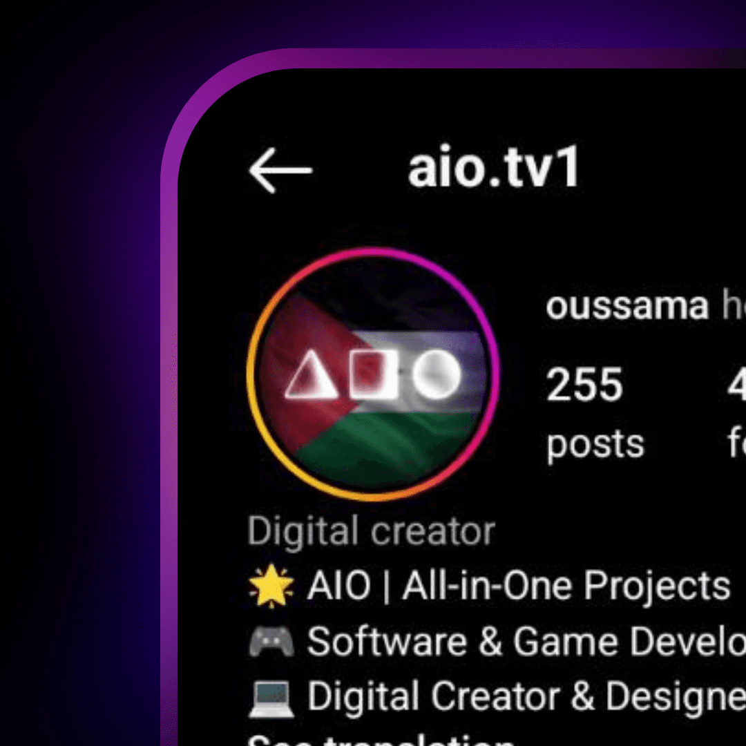
Avatar
Our icon is our face on social media, clearly reflecting Aio's identity. We currently use the Palestinian flag as the background for our profile picture to support the Palestinian cause and remind everyone of this cause. The background can be changed occasionally to suit events or campaigns, while keeping the logo intact.
When using the icon in a square space (with or without rounded corners), an appropriate amount of space should be left between the logo edges and the frame edges to maintain visual balance. In a circular space, more space should be left between the logo edges and the frame edges.


Color
The world is a diverse and wonderful place, and we want to reflect that diversity in everything we do—from the people we interact with to the colors we use. That's why we've developed a bright, beautiful color palette that expresses the spirit of innovation and creativity that defines Aio.

Core Brand Colors
Our primary colors are based on Aio's visual identity, inspired by a balance between simplicity and professionalism. Here's a common hierarchy for their use:
Bright Blue (#005AFF) is our brand's primary color. It expresses vitality, innovation, and, when in doubt, dependability.
Dark blue (#000099) is the secondary color that enhances the logo's presence and is used as a background or supporting element.
Light blue (#03315b) is the secondary color, enhancing the logo's presence and serving as a background or supporting element. (in instagram)
White (#FFFFFF) is typically used for bold text and elements, especially on dark backgrounds.
Black (#000000) is used to add contrast and enhance clarity in designs.
color gradients
We sometimes use color gradients based on primary colors, such as shades of purple and light blue, to add depth and flexibility to designs. These gradients help create more dynamic and engaging designs.

Secondary Colors
We use a range of bold and vibrant secondary colors to add a touch of creativity and fun to our interfaces and graphics. These colors include:
These colors can be used for full backgrounds or as stand-out elements in designs.
Additionally, new colors can be used if they enhance consistency with the background and clearly show the logo, such as Android's Material Color system.
Neutrals
Neutral colors are used to provide hierarchy and additional functionality without competing with primary and secondary colors. These colors include:
These colors help organize content and add depth to designs.
At Aio, we believe that the words and fonts we use play a fundamental role in expressing our identity. As a company working in programming, design, and creative content, we ensure that our modern, clear fonts reflect the spirit of innovation and professionalism that distinguishes us.
That's why we chose the 29LT Bukra and Rubik Medium fonts to be part of our visual identity. These fonts offer the perfect balance of modernity and clarity, making them suitable for both digital and print applications.
29LT Bukra
We chose this font for its modernity and clarity, reflecting Aio's technical sophistication and innovation. Its simple, elegant design makes it ideal for headlines and short texts that need to grab attention.
يتميز بتصميم معاصر وسهل القراءة، مما يجعله مثالياً للتعبير عن هويتنا الإبداعية في اللغة العربية .

Rubik Medium
This font strikes a balance between professionalism and playfulness, making it suitable for long texts and detailed content. Its geometric design reflects precision and organization, essential values in the programming and design fields in which we work.
يوفر توازناً رائعاً بين الاحترافية والبساطة، مع دعم ممتاز للغة العربية، مما يجعله خياراً مثالياً للمحتوى الطويل والعناوين.
Download fonts
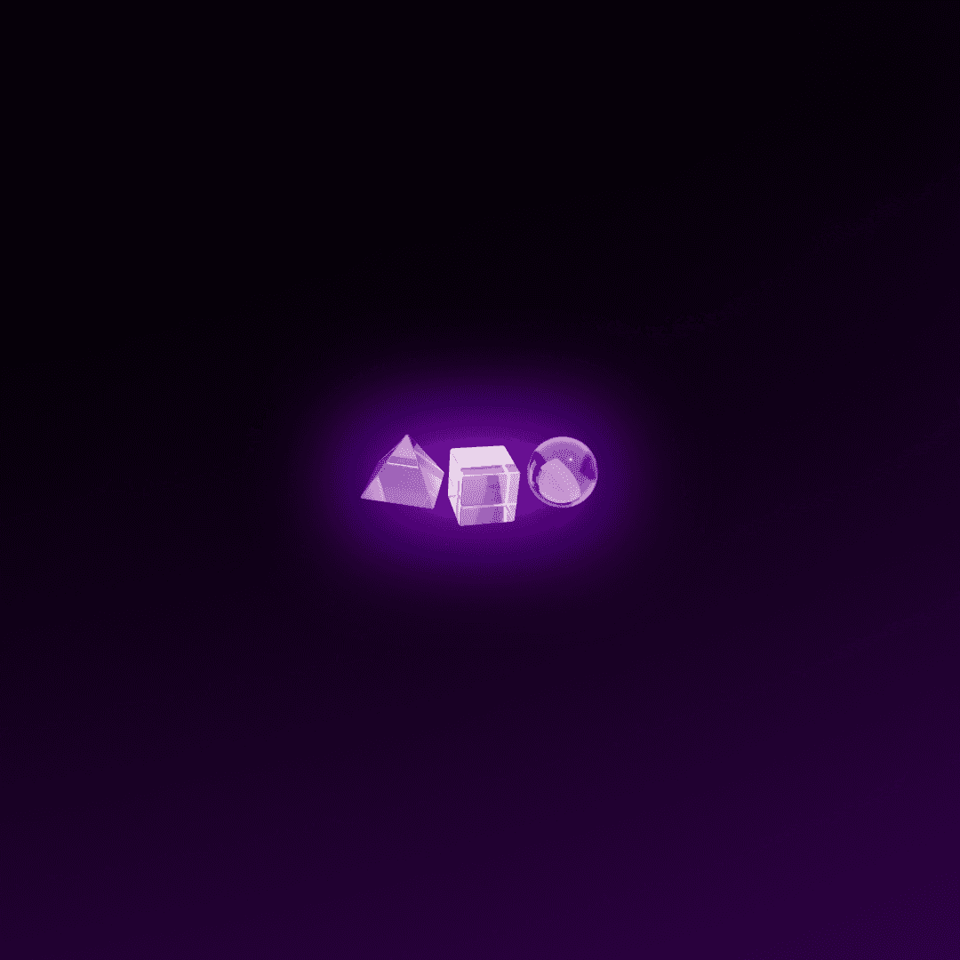
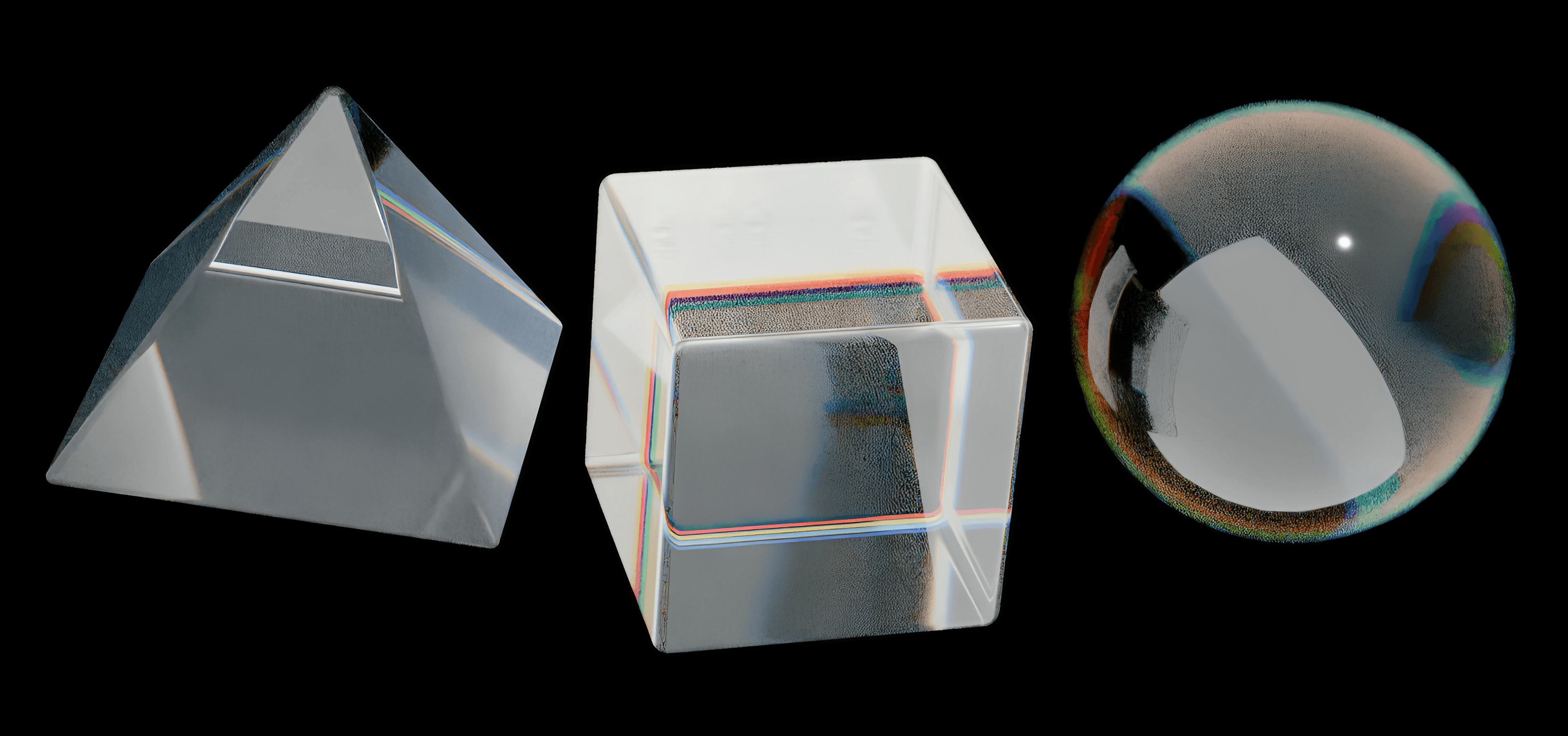
At Aio, we rely on simple, modern illustrations to reflect our creativity, and we use high-quality images that match our brand colors to showcase the diversity of our projects.